7.4 Data Analysis
In this Section, the goal is to explore and understand the available time series data and their relationships and to take the necessary steps towards feature engineering. Features are predictors that we want to include in our forecasting models that are powerful in the sense that they help to improve the quality of forecasts in a significant manner. Sometimes, the modeler also wants to include synthetic features, i.e. predictors that are not observed but for example derived from observations.
Different techniques are demonstrated that allow us to get familiar with the data that we are using. While we are interested to model discharge of Chatkal and Pskem rivers, it should be emphasized that all the techniques utilized for forecasting easily carry over to other rivers and settings.
Let us start with a visualisation of the complete data record. Using timetk::plot_time_series and groups, we can plot all data into separate, individual facets as shown in Figure ??.
data_long_tbl %>%
  group_by(name) %>%
  plot_time_series(date, value,
                   .smooth      = FALSE,
                   .interactive = FALSE,
                   .facet_ncol  = 2,
                   .title       = ""
                   )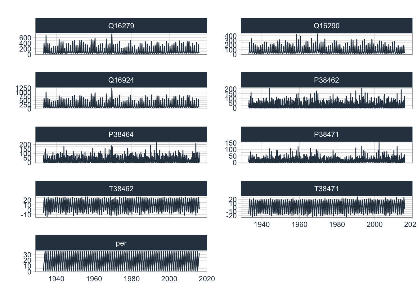
Figure 7.8: Complete Data hydro-meteorological record for the zone of runoff formation in the Chirchik river basin.
7.4.1 Data Transformation
It is interesting to observe that discharge values range over 2 - 3 orders of magnitude between minimum and maximum flow regimes. As can be seen in Figure 7.9, discharge and precipitation data are heavily skewed. When this is the case, it is generally advisable to consider data transformations as they help to improve predictive modeling accuracy of regression models.
data_long_tbl %>%
  group_by(name)  %>%
  ggplot(aes(x=value,colour = name)) +
  geom_histogram(bins=50) +
  facet_wrap(~name, scales = "free") +
  theme(legend.position = "none")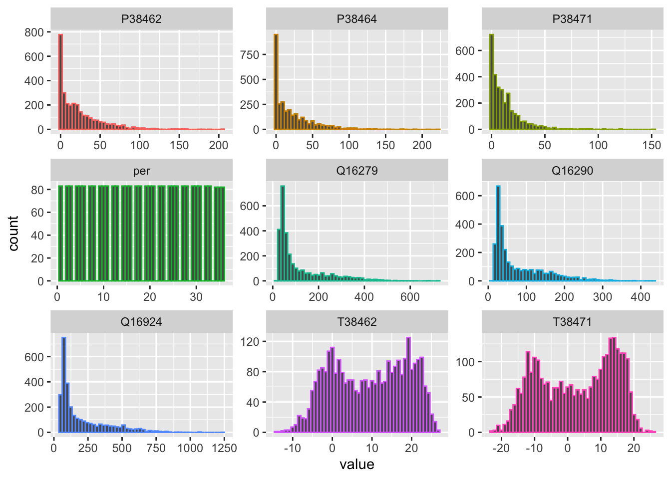
Figure 7.9: Histograms of available raw data.
Let us for example look at a very simple uniform non-parametric transformation, i.e. a logarithmic transformation (see Figure @ref(fig:histogramsData_transformed). As compared to parametric transformation, the logarithmic transformation is simple to apply for data greater than zero and does not require us to keep track of transformation parameters as, for example, is the case when we center and scale the data.
data_wide_tbl %>%
  mutate(across(Q16279:P38471,.fns = log1p)) %>% # transforms  discharge and precipitation time series
  pivot_longer(-date) %>%
  ggplot(aes(x=value,colour = name)) +
  geom_histogram(bins=50) +
  facet_wrap(~name, scales = "free") +
  theme(legend.position = "none")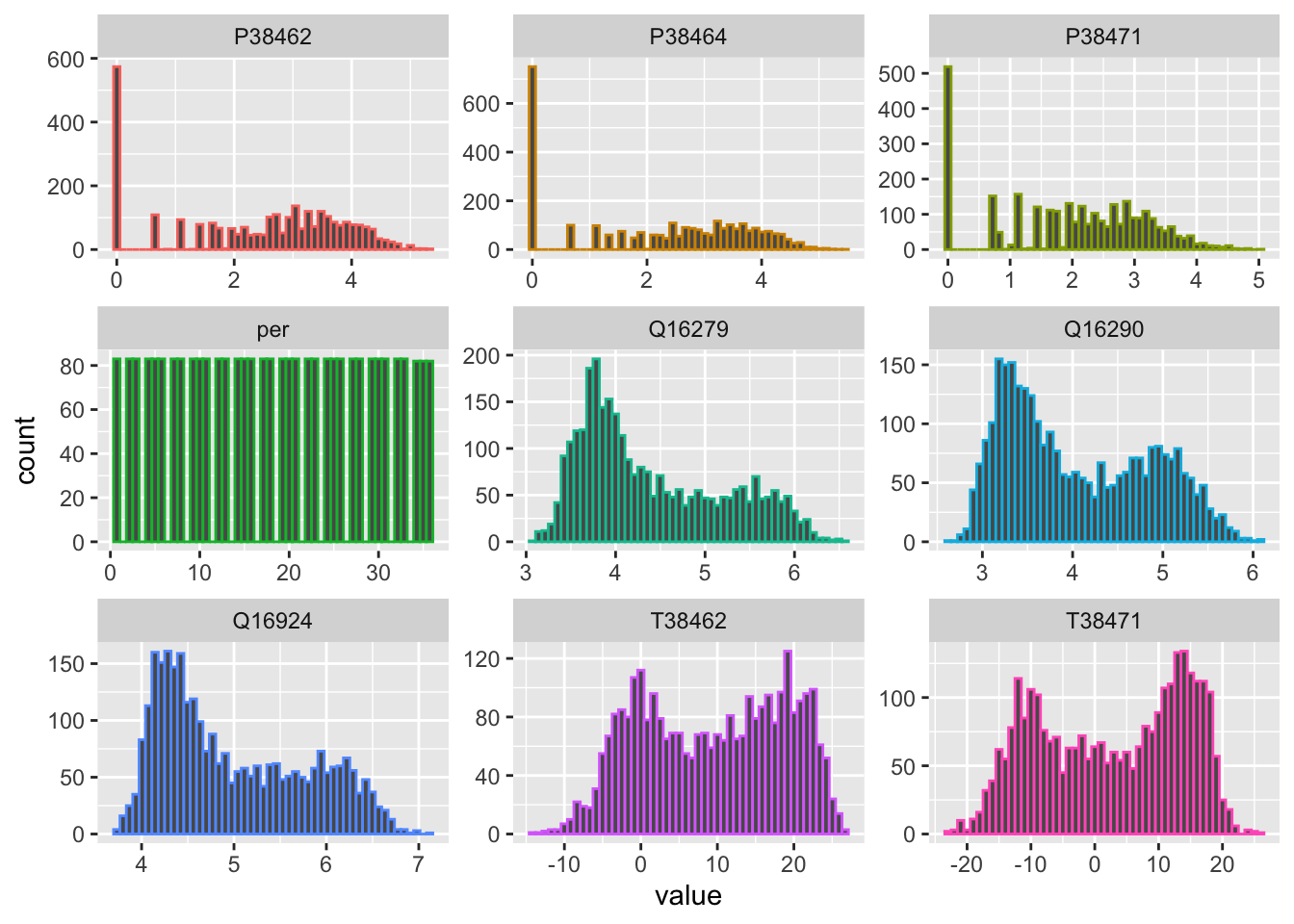
(#fig:histogramsData_transformed)Histograms of transformed discharge and precipitation data together with the raw temperature data.
Please note that with the base-R command log1p, 1 is added prior to the logarithmic transformation to avoid cases where the transformed values would not be defined, i.e. where discharge or precipitation is 0. More information about the log1p() function can be obtained by simply typing ?log1p. Recovering the original data after the log1p transformation is simply achieved by taking the exponent of the transformed data and subtracting 1 from the result. The corresponding R function is expm1().
Clearly, the log-transformed discharge values are no longer skewed (Figure @ref(fig:histogramsData_transformed)). We now see interesting bimodal distributions. At the same time, the variance of the transformed variables is greatly reduced. These are two properties that will help us construct a good model as we shall see below. Finally, the transformed discharge time series are shown in Figure @ref().
data_long_tbl %>%
  filter(name=='Q16279' | name=='Q16290') %>%
  plot_time_series(date, log(value+1),
                   .facet_vars  = name,
                   .smooth      = FALSE,
                   .interactive = FALSE,
                   .title       = "",
                   .y_lab       = "[-]",
                   .x_lab       = "year"
                   )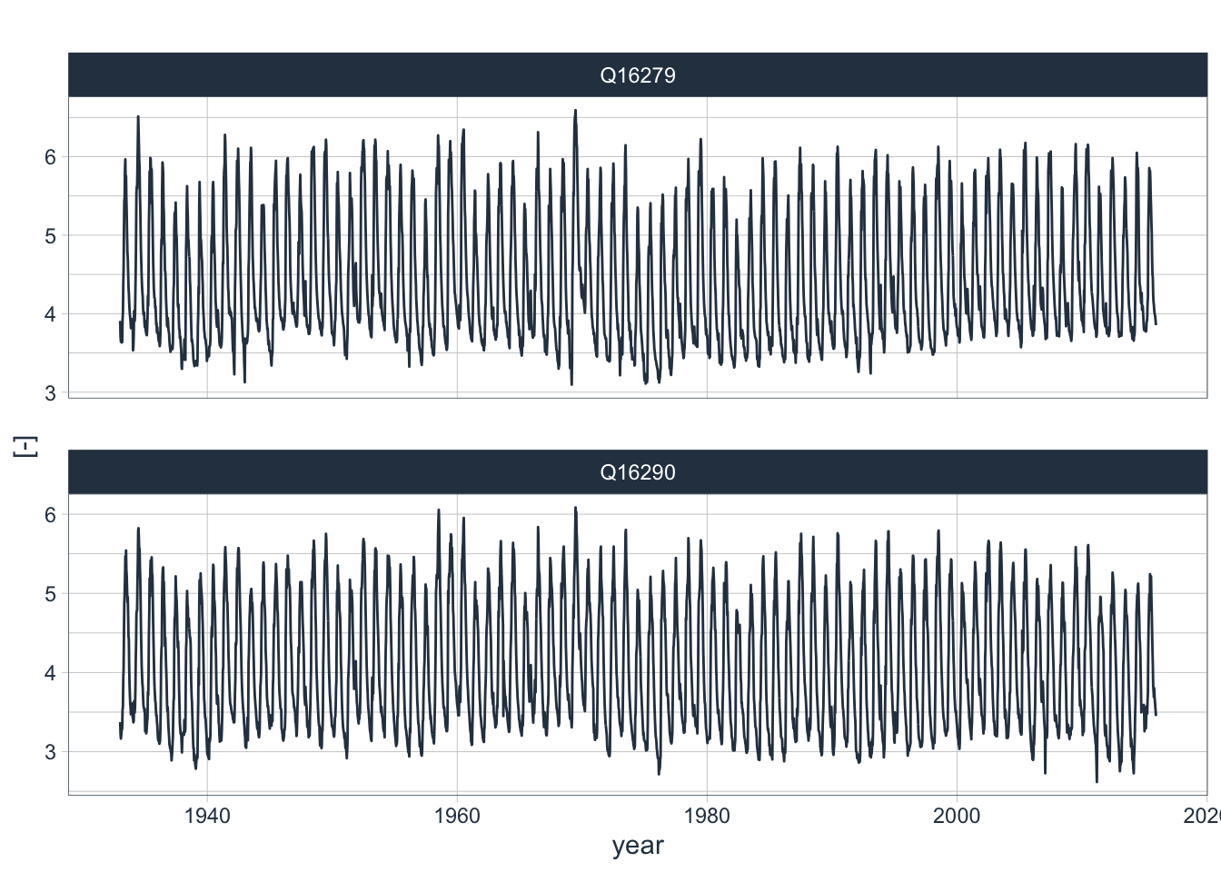
(#fig:dischargeData_log1p)log1p() transformed discharge data.
7.4.2 Detecting Trends
Lower frequency variability in time series, including trends, can be visualized by using the .smooth = TRUE option in the plot_time_series() function. To demonstrate this here, we have a closer look at the temperature data in our data record (Figure @ref(fig:T_trends)).
data_long_tbl %>%
  filter(name == 'T38462' | name == 'T38471') %>%
  plot_time_series(date, value,
                   .smooth     = TRUE,
                   .facet_vars = name,
                   .title      = "",
                   .y_lab      = "deg. C.",
                   .x_lab      = "year"
                   )
(#fig:T_trends)Temperature time series and trends.
In both time series, a slight upward trend is visible that picks up over the most recent decades. We can look at these trends in greater detail, for example at monthly levels (Figure @ref(fig:T_monthly_trends)).
data_long_tbl %>%
  filter(name == 'T38462') %>%
  summarise_by_time(.date_var = date, .by="month",value=mean(value)) %>%
  tk_ts(frequency = 12) %>%
  forecast::ggsubseriesplot(year.labels = FALSE) +
              geom_smooth(method = "lm",color="red") +
              #ggtitle('Development of Monthly Mean Temperatures from 1933 - 2015 at Station 38462') +
              xlab('month') +
              ylab('Degrees Celsius')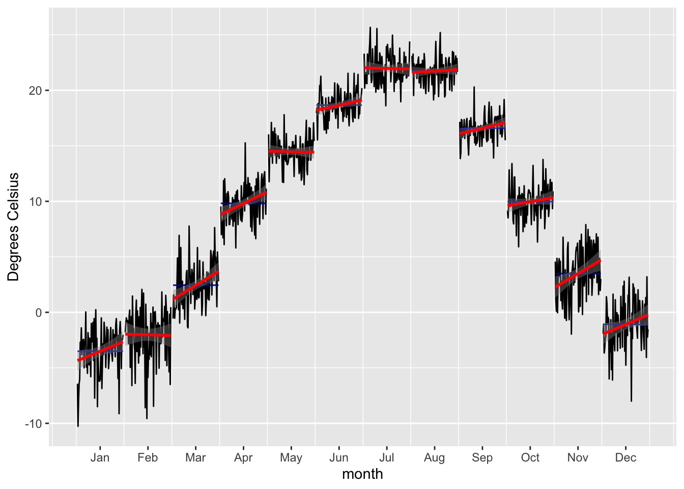
(#fig:T_monthly_trends)Sample development of Monthly Mean Temperatures from 1933 - 2015 at Station 38462.
In the Figure above, a significant winter warming over the period of data availability is confirmed at Pskem meteorological station. As shown in Chapters 2 and ??, these trends are observed throughout the Central Asian region and are an indication of the changing climate there. We will have to take into account such type of trends in our modeling approach.
7.4.3 Auto- and Crosscorrelations
A time series may have relationships to previous versions of itself - these are the ‘lags.’ The autocorrelation is a measure of the strength of this relationship of a series to its lags. The autocorrelation function ACF looks at all possible correlations between observation at different times and how they emerge. Contrary to that, the partial autocorrelation function PACF only looks at the correlation between a particular past observation and the current one. So in other words, ACF includes direct and indirect effects whereas PACF only includes the direct effects between observations at time t and the lag. As we shall see below, PACF is super powerful to identify relevant lagged timeseries predictors in autoregressive models (AR Models).
Figure @ref(fig:Q_autocorr) shows the ACF and PACF over the interval of 72 lags (2 years). The AC function shows the highly seasonal characteristics of the underlying time series. It also shows the pronounced short-term memory in the basin, i.e. the tendency to observe subsequent values of high flows and subsequent values of low flow - hence the smoothness of the curve. This time of autocorrelation behavior is typical for basins with large surface storage in the form of lakes, swamps, snow and glaciers, permafrost and groundwater reserves (A. 2019). The Chatkal river basin certainly belongs to that category.
data_long_tbl %>% filter(name == 'Q16279') %>%
  plot_acf_diagnostics(date, value,
                      .show_white_noise_bars = TRUE,
                      .lags = 72,
                      .title = ""
                      )
(#fig:Q_autocorr)Autocorrelation function (ACF) and partial autocorrelation function (PACF) are shown for the discharge time series at station 16279.
But is there also autocorrelation of the annual time series? Let us test.
Q16279_annual <- data_long_tbl %>% filter(name == 'Q16279') %>% dplyr::select(-name) %>%
  summarize_by_time(.date_var = date,
                    .by="year",
                    sum=sum(value)*3600*24*10/10^9)

Q16279_annual %>% plot_time_series(date,sum,
                                   .smooth = FALSE,
                                   .title = "",
                                   .x_lab = "year",
                                   .y_lab = "Discharge [cubic km per year]")
Figure 7.10: Testing autocorrelation at annual scales for discharge at station 16279.
Q16279_annual %>%
  plot_acf_diagnostics(.date_var = date,
                       .value = sum,
                       .lags = 50,
                       .show_white_noise_bars = TRUE,
                       .title = "",
                       .x_lab = "year")
Figure 7.10: Testing autocorrelation at annual scales for discharge at station 16279.
The above Figure @(fig:annualAutoCorr) shows a fast decaying autocorrelation function for the annualized time series where even lag 1 values are no longer correlated in a significant manner.
The PAC function, on the other hand, demonstrates that lag 1 is really critical in terms of direct effects (Figure @ref(fig:Q_autocorr)). After that, the PACF tapers off quickly. To utilize these findings in our modeling approach that uses lagged regression is important, as we shall see below.
We can also study cross-correlations between two different time series. In other words, in cross-correlation analysis between two different time series, we estimate the correlation one variable and another, time-shifted variable. For example, we can cross-correlate discharge at Gauge 16279 (Chatkal river) to discharge at Gauge 16290 (Pskem River) as shown in Figure @ref(fig:crosscor_Q). As is easily visible, the discharge behavior of the two rivers is highly correlated.
data_wide_tbl %>% plot_acf_diagnostics(date,Q16279,
                                       .ccf_vars = Q16290,
                                       .show_ccf_vars_only = TRUE,
                                       .show_white_noise_bars = TRUE,
                                       .lags = 72,
                                       .title = ""
                                       )
(#fig:crosscor_Q)Cross-correlation analysis of the two discharge time series Q16279 and Q16290.
Converse to this, discharge shows a lagged response to temperature which is clearly visible in the cross-correlation function.
data_wide_tbl %>% plot_acf_diagnostics(date,T38471,
                                       .ccf_vars = Q16279,
                                       .show_ccf_vars_only = TRUE,
                                       .show_white_noise_bars = TRUE,
                                       .lags = 72,
                                       .title = ""
                                       )
(#fig:ccf_TQ)Cross-correlation between temperature at station 38471 and the discharge at station 16279.
A less pronounced cross-correlation exists between precipitation and discharge when measured at the same stations (Figure @ref(ccf_PQ)).
data_wide_tbl %>% plot_acf_diagnostics(date,P38471,
                                       .ccf_vars = Q16279,
                                       .show_ccf_vars_only = TRUE,
                                       .show_white_noise_bars = TRUE,
                                       .lags = 72,
                                       .title = ""
                                       )
(#fig:ccf_PQ)Cross-correlation between temperature at station 38471 and the discharge at station 16279.
7.4.4 Time Series Seasonality
There is a pronounced seasonality in the discharge characteristics of Central Asian rivers. One of the key reason of this is the annual melt process of the winter snow pack. Figure @ref(seasonalityDiagnostic_Q) shows the seasonality of the log-transformed discharge. These observations can help in investigating and detecting time-based (calendar) features that have cyclic or trend effects.
data_long_tbl %>%
  filter(name=="Q16279" | name=="Q16290") %>%
  plot_seasonal_diagnostics(date,
                            log(value+1),
                            .facet_vars = name,
                            .feature_set = c("week","month.lbl","year"),
                            .interactive = FALSE,
                            .title = ""
                            )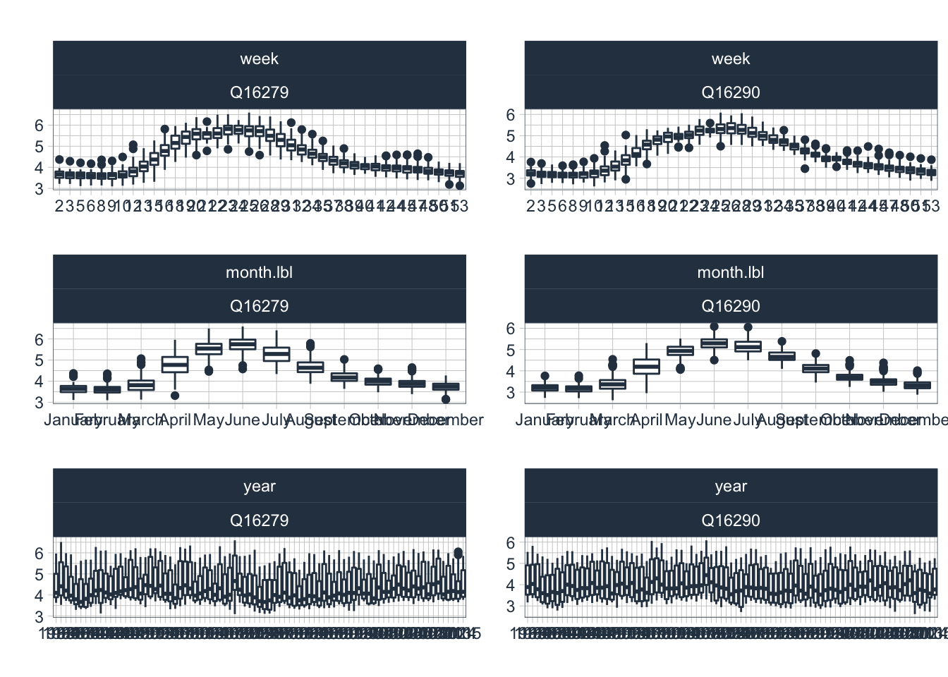
(#fig:seasonalDiagnostic_Q)Seasonal diagnostics of log1p discharge. Weekly (top row), monthly (middle row) and yearly diagnostics (bottom row) are shown for the two discharge time series.
Figure @ref(seasonalDiagnostic_P) shows the seasonal diagnostic for the log-transfomred precpitation time series. The significant interannual variability is visible. In the annualized time series, no trend is available.
data_long_tbl %>%
  filter(name=="P38462" | name=="P38464" | name=="P38471") %>%
  plot_seasonal_diagnostics(date,
                            log1p(value),
                            .facet_vars = name,
                            .feature_set = c("week","month.lbl","year"),
                            .interactive = FALSE,
                            .title = ""
                            )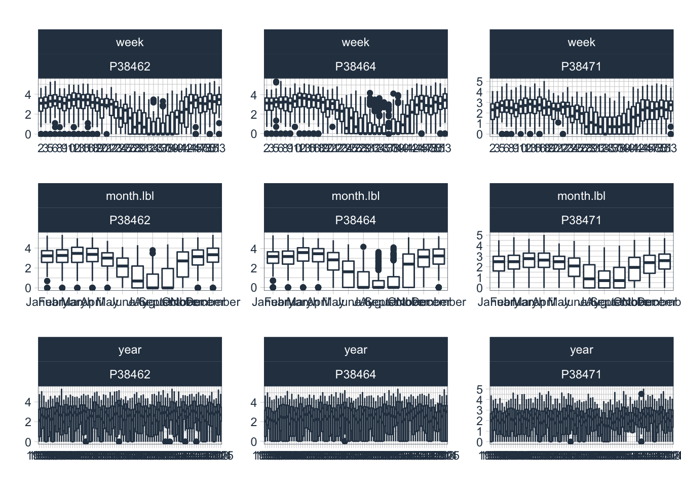
(#fig:seasonalDiagnostic_P)Seasonal Diagnostics of precipitation Weekly (top row), monthly (middle row) and yearly diagnostics (bottom row) are shown for the available precipitation data in the zone of runoff formation of the two tributary rivers.
Finally, Figure @ref() displays the seasonal diagnostics of the temperature time series. Notice that we use untransformed, raw values here for plotting.
data_long_tbl %>%
  filter(name=="T38462" | name=="T38471") %>%
  plot_seasonal_diagnostics(date,
                            value,
                            .facet_vars = name,
                            .feature_set = c("week","month.lbl","year"),
                            .interactive = FALSE,
                            .title = "",
                            )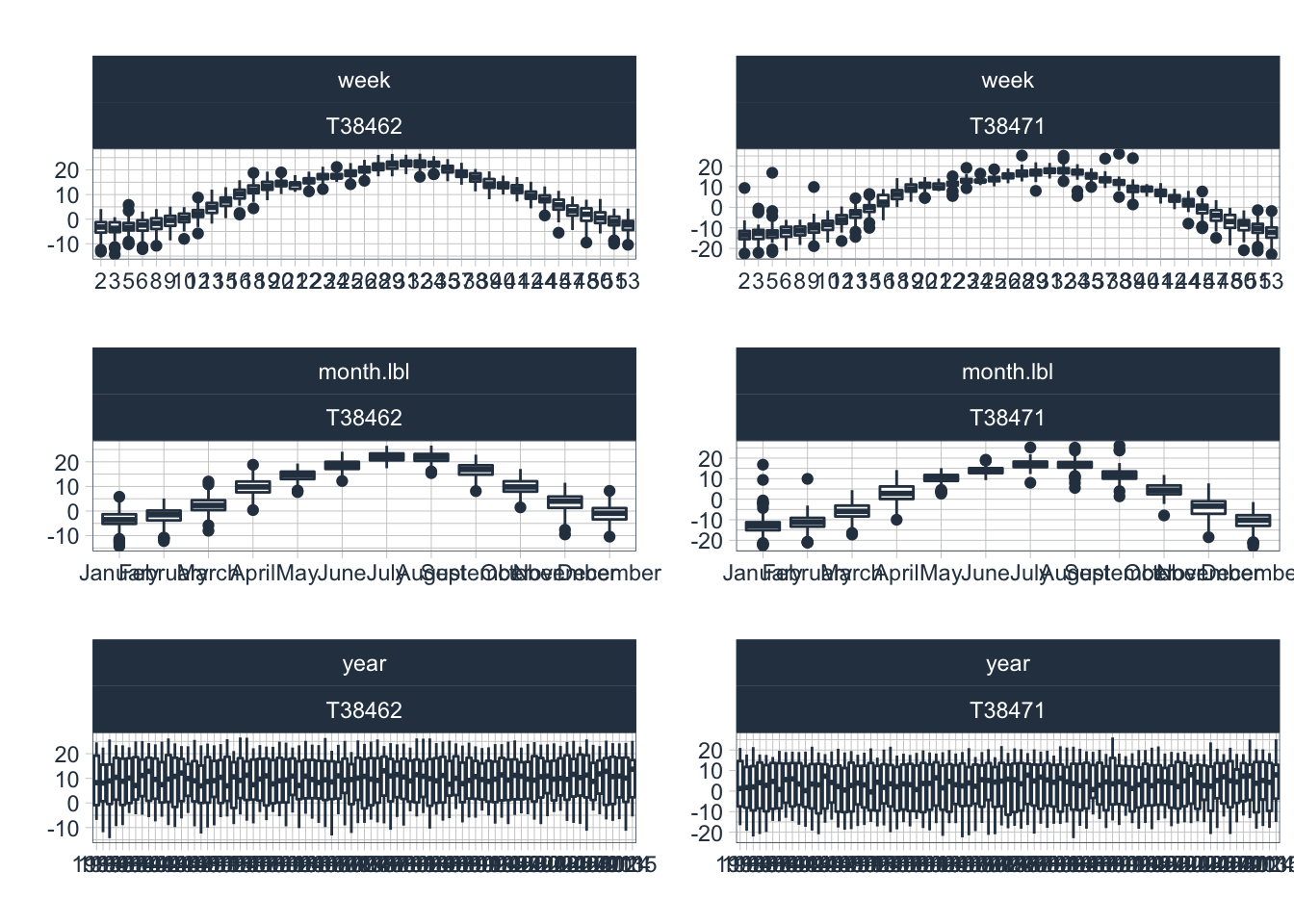
(#fig:seasonalDiagnostic_T)Seasonal Diagnostics of temperature Weekly (top row), monthly (middle row) and yearly diagnostics (bottom row) are shown for the available temperature data in the zone of runoff formation of the two tributary rivers.